Performance Reports (and Other Lies)

George Bernard Shaw told us that the single biggest problem in communication is the illusion that it has taken place. Obviously, he was talking about performance reporting[1] and the many ways that performance outcomes are misrepresented.
Sometimes this is deliberate; often it is inadvertent. The result is to distort the data or make erroneous comparisons. An illusion, indeed.
If we are going to the trouble of collecting and reporting performance data (and, of course, I'm thinking of process performance data), then we should do so accurately, transparently, and in context. The presentation of the data should not distort or confuse.
There are many ways in which data can be manipulated in its presentation — for good or evil. Some common problems (opportunities) are discussed below.
That's a stretch!
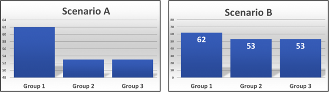
Figure 1. Which is better, A or B?
Figure 1 depicts three different groups operating in two scenarios. Group 1 does so much better than the others in Scenario A. Let's investigate and find out why … or not.
Both scenarios use the same data with the only difference being that the Scenario A chart uses a different vertical axis that is emphasizing a relatively small difference between group performances.
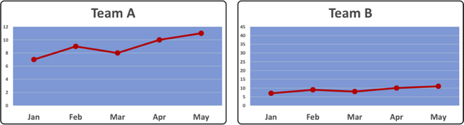
Figure 2. We have a winner!?
Wow, Figure 2 shows Team A is outperforming Team B by a long way in every month. Let's investigate and find the magic. Nope, same data, different scale. Team A's magic is in their knowledge of visual presentation hacks!
Smooth operations
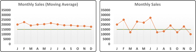
Figure 3. Smoothing away the problems.
While we don't want to chase shadows, smoothing out the variations might hide some important details.
The moving average on the left in Figure 3 looks OK; it might be dipping down a bit but it's above the target in every month.
Hang on, if we look at the monthly data, we see sales were below target in five months of the year. It also seems that the monthly data has been much worse in the second half of the year.
That's a very different message. Maybe that's OK; it might be what we expect in those months, but we don't see that in the chart of monthly averages.
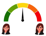
Points of light
 Traffic light performance indicators (aka red, amber, green (RAG) reporting) have the benefit of being simple to use and interpret.
They can also have the drawback of being simplistic. There's not much room for nuance in the no–maybe–yes sequence.
Inevitably the data represented is an aggregation of outcomes and the detail is lost. The thresholds set for each color are also unforgiving — for example, 80% might be amber, but 79.9% is red.
Depending on the range of scores that define the green zone, we might have a strong trend of deteriorating performance, but the light is still green — there are no shades of color in a traffic light system.
2 points is not a trend
 Comparing two points of data — e.g., this month and last month, this month to last year, etc. — might be of limited interest. It also has the potential to be very dangerous.
There just isn't enough information to allow you to make anything other than a tentative and superficial assumption about actual performance.
Sometimes you just must wait for more data points before any viable conclusion can be drawn.
What effective management needs to know is what is likely to happen next, not just what has already happened.
Heat but no light
Heatmaps can provide striking visual representations, and they can work well. They pack a lot of information into a small space, and that can be both negative and positive.
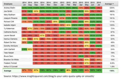
A lot of assumptions are necessary to create an aggregated graphic such as this one. For example, we might get the impression that half (more?) of the team are not meeting quota, but are all quota shortfalls equal?
Of course, any reporting method that relies on color will be problematic for people with color vision deficiency.
The detail is the devil
Some of you might find a table like the one below (Figure 4) informative and engaging. The rest of us struggle to form a coherent view of what we are being shown.
Figure 4. Hiding in plain sight.
While it is useful and appropriate to provide the raw data along with any graphic to give context and transparency, the raw data alone will not highlight key messages.
Of course, if you want to hide information, the middle of a large, dull table is a great place to do so!
The devil is in the detail
Sometimes an extra level of granularity is required to gain insight into performance. Weekly performance data may look fine, while daily outcomes are problematic. Daily peaks and troughs are being averaged out of sight in this weekly aggregation.
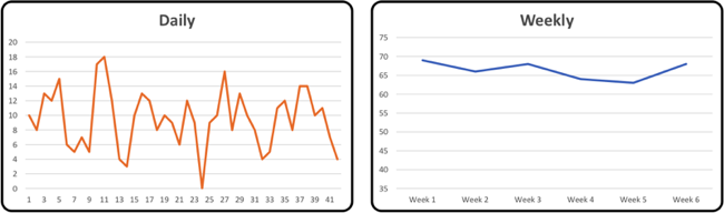
Figure 5. A question of detail.
Half of you are below average!
 On average, averages can be very misleading.
This is another example of how calculated numbers can become an anodyne representation of the original dataset with most, if not all, variation hidden.
We are often very interested in those variations because they give better insight into performance.
In practice …
Effective measurement and reporting of process performance is fundamental to process-based management. We must report all outcomes (the good, the bad, and the ugly) fairly and transparently. Deliberate or unintentional distortion of the performance data will leave us with just the illusion of management.
References
[1] No, of course he wasn't — but he could have been. OK, he likely knew nothing about performance reporting, but he did know a lot about (mis)communication.
# # #
Standard citation for this article:
About our Contributor:


Online Interactive Training Series
In response to a great many requests, Business Rule Solutions now offers at-a-distance learning options. No travel, no backlogs, no hassles. Same great instructors, but with schedules, content and pricing designed to meet the special needs of busy professionals.
How to Define Business Terms in Plain English: A Primer
How to Use DecisionSpeak™ and Question Charts (Q-Charts™)
Decision Tables - A Primer: How to Use TableSpeak™
Tabulation of Lists in RuleSpeak®: A Primer - Using "The Following" Clause
Business Agility Manifesto
Business Rules Manifesto
Business Motivation Model
Decision Vocabulary
[Download]
[Download]
Semantics of Business Vocabulary and Business Rules